The UK Mobile-first Site Architecture was developed after high-level whiteboarding of the structure with SMEs and business leads in the London office. The results were transferred to Excel. Using Excel as a common software facilitated more collaboration and feedback by having an editable, working version for the business leads. Once the structure and labeling was settled, the example below was distributed to a broader audience for validation and ultimately used by dev for building the site. The visual tree structure and color coding helped the users to understand the structure and resulting navigation level hierarchy.
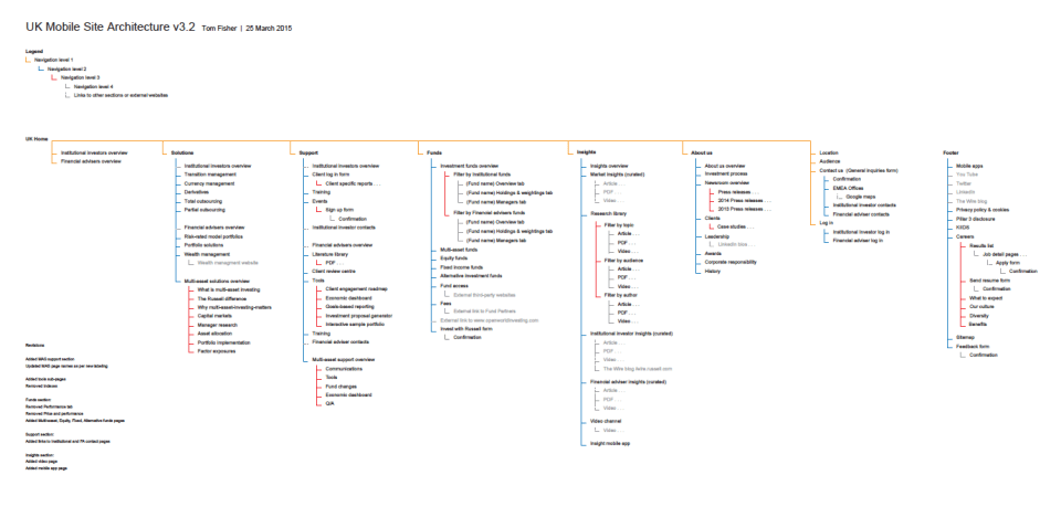
Click on the image to see the pdf.
Below is an example of the finished architecture for the Japan website. The same methodology used in the London office was used with the Tokyo office SMEs and business leads. The biggest challenge was providing clear communication in two languages structures.
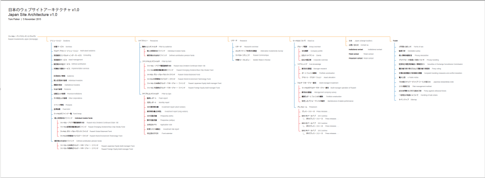
Click on the image to see the pdf.
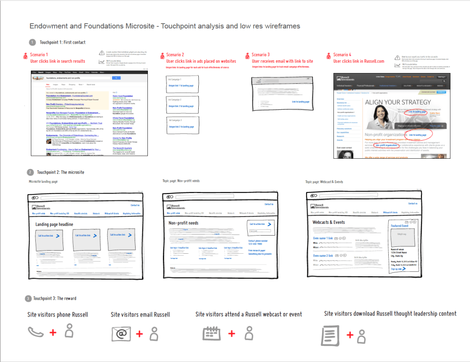
Below is an example of user access touchpoint analysis for a microsite. This was the initial idea presented to the business leads in New York to examine and define the marketing strategy. It was kept in a low res digital format in this stage so the SMEs would feel it was not “set in stone” and were comfortable editing and contributing.
The next level of deliverables for the microsite explain the audience personas and conversion goals. Being a simple microsite, the site architecture and high-res wireframes were able to be shown together.
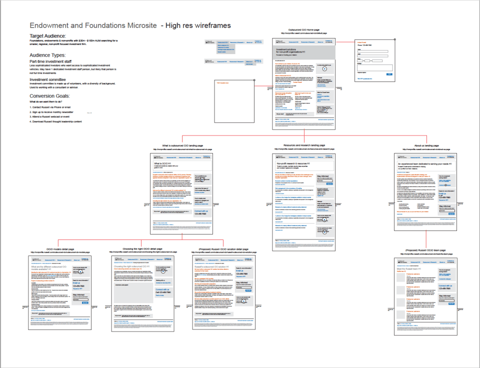
Click on the image to see the pdf.
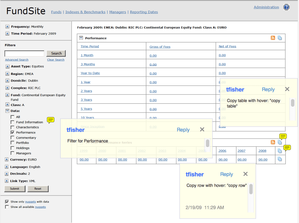
Below is FundSite, an XML database used for creating reports using an automated publishing system. System users would copy the links of data they need into report templates. When the database was updated, all system users had to do was “refresh” the reports, then publish pdfs for distribution.
Click on the image to see the multiple page pdf.
 Tom Fisher Portfolio